Friday, 19 June 2015

Wix VS Word Press

In the past couple days I have tried to make websites for two artist, one for A$AP Rocky and one for Drake. For A$AP Rocky I tried using wix and for Drake I used word press, firstly I'll talk about my much easier experience with Wix.

Wix was incredibly easy to use and just straight forward in general, the interface allowed for me to edit the site as its previewed and same goes for adding images. Here are the main tools I used to design the home page and about page.
The bar on the left was on the left of the screen, this had most of the things one could think of adding to a website, from social links, song previews to uploading pictures or videos to place anywhere on the blog. The right bar has all the basic tools to alter text such as its size, placement, font and more. 


Now moving onto word press, I had a very different experience. With wordpress you can't edit with the preview of the website, also the layout isn't very easy to understand. The general impression that I got from it is that its badly built, especially for new users. 

Below is a preview of the website I made with Wix:


Here are the links to the websites:

Wix:
http://victortreptowuk.wix.com/asaprocky


Word Press:
https://drakesadstuff.wordpress.com/

Thursday, 18 June 2015

Richard Dyer - Star image

Richard Dyer is a professor in the department of film studies in King's College London, he is better known for being a theorist on musicians, film and tv actors. More specifically he explains his view on the connection that famous artists have with their audience, here is one of his most famous quotes:
"Stars are representations of people, they are an image, not a real person, constructed out of a range of materials (advertising, magazines, films). They are merely products created by institutions for financial gain, and target one specific audience."
In his view the stars (famous artists) are simply fictional people, as in they don't act like themselves but as who they are believed to be. He also mentions that they are constructed out of a range of materials, with this he is referring to how stars are constantly trying to gain popularity, such as with advertising, magazines and films. To them even the paparazzi publishing a story on them because they did something silly is good, as it reminds the public that they exist.


Tuesday, 16 June 2015

Synthetic and Organic Album Covers

In this post I'm going to be talking about the difference in a synthetic and organic covers.


My first example is from Logic's most recent album "Under Pressure". This album contains hip hop and rap, unlike most hip hop and rap albums Logic isn't trying to be something he is not (it appears), which is the case for most rappers. Most rappers  are known for their flashy lifestyles (apart from their music career), from the cars, houses to the private jets. In Logic's cover we see his original 'Set up' or 'studio' as he describes in many of his songs.  
Logic is an incredibly likable character, weather it is all an image so his fans feel more connected to him or if its simply how he is, either way it clearly works for him with his recent success globally.   
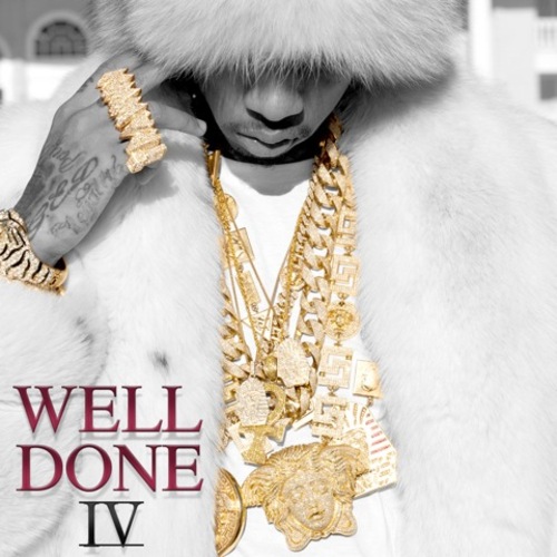
Here is an example of a synthetic mix tape cover (to the left). This is "Well Done IV" by Tyga, released in December 2013. Immediately by looking at this album we can see the impression that tyga is trying to give of with this, that he is rich and has "swagger". It isn't only his cover that seems to be super synthetic, so are his music videos, such as "Young Kobe", which consists of him rapping on a hill with his private helicopter and then flying out to his luxurious house. He's also wearing what seems to be a golden colored snapback following the color theme he set with the album cover.


Here is the music video for "Young Kobe", which is in Tyga's "Well Done IV" mixtape:

Analysing: Marlowe's Testcard and Roja Album Covers

In today's class we analyzed many of Marlowe's Album Covers, I found this task particularly difficult as I found it hard to make the connection with the type of music these album covers would best suit.

Here are the first three covers we looked at:


For the first cover of Marlowe's debut EP “its turning me on” we can see a woman or girl leaning over looking at a device. What is interesting from this album cover is that it has been faded in with red and some of it has been left with shades of black. This establishes Marlowe's color theme. The red gives of the impression that this album cover could be for genres like rock and alternative. The second album cover "darksparklecorner" really makes you wonder what inspired such a odd picture. The exposure has clearly been raised a lot, not sure what impression the artist or designer wanted to give with this. It makes me feel like the kid is even more surprised, this again gives the impression that the type of music that came with this album might surprise or excite you. This cover has also made me think if it was staged or not, maybe the picture was taken when actually surprising this kid to get a more honest reaction. The "a day in july" album gives of a very different vibe from the last two, unlike the others it has a lot of light and depth, this makes me think that the music will be more positive and happy in general. This also makes me think that this album will have more of a world music vibe.

Here are the other three album covers we looked at:
The “Deep Breathe Fake Air” album cover is one of the few that actually feel like they have a connection or that describe each other as we can see in it a person taking a breath. With this cover Marlowe is still using red as his main color, but this time has added in a lot of light blue. He also continues only using graphic covers, this must be a part of the image he is trying to build.

"Lines" is the penultimate album cover we looked at, as seen on the picture there really isn't much color, this cover consists of mostly white and black words and lines. The lines give of the impression that this album could have songs that are techno or just more house in general. There isn't much more I get from this picture. 

"Promises I should have kept" is the final album we looked at. Immediately from looking at this cover it gives of a vibe that the music in it will have a Latin feel, such as salsa, merengue or tango. In this album like most Marlowe put or choose there to be some red, even though the general theme of the cover is black and white. It does make sense that "ROJA" is written in red as it means red in Spanish.


Sunday, 14 June 2015

Music video analysis Madonna: Like a prayer

In 1989 Madonna released the music video "Like a prayer" which led to a lot of controversy, especially from different ethnic groups and Christians. There are many clear reasons for this, the video has several factors that come across to many (from the time) as wrong for many reasons.


The video shows us Madonna's visit to church and has flashbacks from her past. One of the first things she does is go up to what appears to be Jesus, in this video he is african american, this alone would have already brought up a lot of controversy at the time to many Caucasians, especially ones that were racist, which will have been many more people than today. It was later discovered that this man wasn't meant to represent Jesus but Madonna probably wasn't disappointing with this as it just led to more people talking about it and making her music and herself more relevant. Even though Madonna might have not intended to make this african american  man be represented as Jesus she certainly knew that there would be lots of talk about how the only holly figure she shows is african american.

Another major part of the video that caused so much controversy is a scene where she falls asleep and remembers her past. In this scene we see a squad of white males stabbing and harassing her, we then see that the african american man that was before seen as Jesus is running to help her as the white men ran away, he is then caught by the police and the police think he injured her. It is clear why this caused a lot of controversy. Firstly there will have been many Caucasian men that will have said that this is a bad way to display police officers as they aren't trying to be racist or stereotypical but happen to have only seen the african american man. This will also have made many african american's want to speak up and express their hate for segregation due to race, as they might have claimed that the police saw the gang of Caucasian males but decided to ignore it because they thought that the african man deserved it or was about to do the same.        


Below is the music video for "Like a Prayer" by Madonna

Friday, 29 May 2015

The Campaign

In this post I will be analyzing two artists and what they did in their campaigns.

Logic


File:Logic backstage in Orlando on April 8 2014.jpg
Sir Robert Bryson Hall II aka Logic
Firstly I'll be analyzing Sir Robert Bryson Hall II aka Logic, he was born on the 22nd of January in 1990 making him only 25 years old. He is originally from Gaithersburg, Maryland. He has been active in the music industry since 2009 with his group known as the RattPack, but only really gained a considerable amount of global recognition with his latest album Under Pressure. Before this album he mostly just made mixtapes without much help, his first step up was with Mind Of Logic when he got signed to the music label Visionary Music Group. Since then it is clear that his music videos and digipaks look much more professional.
Logic's color theme tends to be black, white and grey, we can see this in many of his music videos, digipaks and on the merchandise on his website. On the right is a picture of Logic, at first glance one would think that hes just a normal guy yet he came from a household of drug addicts and never graduated. One of the reasons many of his fans have respect for his music is because of how honest some of his lyres are that tell the truth about his past. Not something that can be said for most artists now a days. The picture below shows a great example of his color 
Digipak for "Young Sinatra"
theme, this one is from his mixtape "Young Sinatra" released in 2011. He named it Young Sinatra as he considers himself to be the reincarnation of Frank Sinatra. It is also clear that he wanted to give of the impression of this being an old school mixtape. Even on the actual disc Logic is just wearing a casual sweater in a small looking room, This shows how he isn't a millionaire (like many rap and hip hop artists try to fake to give the impression that they were successful) as he is proud of where he is at in his life.
Gif from "Walk On By" by Logic
Here is an example of how he includes his color theme into music videos, in this gif we see a couple seconds from Walk On By, one of Logic's more successful songs prior to his Under Pressure Album. It has surpassed three million views on youtube, which in early 2013 was a big jump for Logic since most of his songs were reaching around 500k views at the time. As seen there are many clips that are in black and white and also have this old camera effect to give the impression that this footage was possibly from "back in the day" as he often refers in his music.  Here is an example of how his merchandise follows this black, white and grey color theme. Below is some of his clothes from his website. 


I believe that the overall goal that Visionary Music Group is trying to get to is give the impression that this guy is a old school hip hop artist. I think this is a very successful campaign, not because of his fame because he isn't that famous globally but because of his growth rate in the past year or two. In the course of two years, Logic went from the being in the underground of being popular on social media to making his way to world tours, many of which get sold out in the first week of release. 


Logic was even recently on the XXL magazine with much more famous artists such as Big Sean, YG, French Montana and of course Kendrick Lamar. In this magazine he is described as "Hip-Hop's New Threat" and I couldn't agree more, in fact I find it strange that he isn't so much more successful then he is now. Below is the Cover of the XXL magazine, logic's name and subtitle is seen on the top right of the cover.

Cover from XXL Magazine.

Here is the music video that was previously mentioned, "Walk On By" by Logic. Personally one of my favourite songs by Logic, partially because of the great soundtrack in the background but also because of some of the incredibly smart lyres. Such as when he says "My flow un-killable when I be murdering syllables But I take my time, slow it down, check the rhyme Perfectionist to the dime," (at 2:39)
This represents how is flow is like no other artist and how he'll take his time to perfect his rhymes like a "dime". This part also begins with Logic rapping very fast but then half way through slows dow in a more rhythmic fashion which reflects his lyrics as well. IIts the little things like this that I think really keep his audience interested in him and his work.


A$AP Rocky


The next artist that I will be analyzing is Rakim Mayers, better known as A$AP Rocky, unlike Logic he is at a very different point in his career. He is a Hip Hop artist originally from Harlem, New York. He created the A$AP Mob with A$AP Yams back in 2007, A$AP represents "Always Strive And Prosper". Since he has had two major peaks in his career thanks moistly to two albums, "Live. Love. ASAP", released in 2011 and "Long. Live. ASAP" in 2013.


Immediately from looking at these albums its easy to tell the general theme, the most visible aspects being the black and white color theme on all three albums and the american flag on "Live Love A$AP" and "Long Live A$AP".  In the most recent album (At Long Last A$AP) released this year (2015) he put a little bit of color, but this was in memory of his friend A$AP Yams (Co-Founder of A$AP) as he had a black patch below his right eye. This goes to show how important it is for artists to keep their themes on their products, mostly because they want to give the product that the consumer expects and wants to get. 

This black and white theme is also applied on A$AP Rocky's shared Mob clothing website as shown below.
Screen Capture From The A$AP Mob Website  (http://goo.gl/aXlNI4)

As seen on the majority of his clothing, after having helped the well known clothing brand "Hood By Air" he has now focused more on his own brand, which I personally like. Of course following the black and white theme, here are some examples.

The entire A$AP Mob smartly all wear clothing from their own store at concerts, this encourages the fans and just normal audiences to want to look and feel like one of them. It definitely works, after having been to several hip hop & rap concerts (even a A$AP one) it doesn't shock me.

Below is one of A$AP Rocky's brand new songs named "L$D", whats really interesting about this song and music video is that its very different from Rocky's tipical song and videos. Normally he goes for a crazy intense beat while he raps considerably fast, and normally his music videos will tendto be relatively dark. In this new song and video we see a much brighter video with beautiful scenery and a much calmer phase in his lyres. Very rare to see such a big change like this in such a short period of time in the music industry, but I definitely think it worked as I personally really enjoy the song and the video.     


Thursday, 28 May 2015

Conventions Of Genre Videos

Here are some of the most common (and expected) things to be seen in certain genres of music videos:


Rap:

Money
Good Looking Women
Guns
Drugs
Low riders / Super Cars (Type of car)
Gold
Gangs
Bandannas
Police
Cheap Looking House / Mansion


Rock:

Live concert, Dark area, Smoke, Black eye liner, Gothic clothing, Guitar solos, Big drum sets etc..

Country:    

Located: farm / field, Farm Animals, Banjos, Big Trucks, Break Ups / Getting Back Together, Facial Hair, Dust balls rolling around etc..

Wednesday, 27 May 2015

Tuesday, 26 May 2015

Intro To A2

I've finished AS now, I just started A2 and am looking forward to working on a musician. The aspect of working on a music video sounds very existing! I look at music videos a lot when listing to music so it will be nice to see what its like on the production side of things. Also looking forward to the digipak and making a website. I've already made a website for my portfolio so this could definitely help me improve it. I've never made a digipak but have worked with photoshop a lot which will hopefully help me with making a great looking digipak.
My favorite genres are Hip Hop & Rap, hopefully I'll be able to work on an artist that makes these types of music.

This is a 10 second gif of "L$D" one of A$AP Rocky's new music videos that came with his new song.

Wednesday, 18 March 2015

Evaluation Task 5: How Did You Attract/Address Your Audiences?

What pleasures can your target audience gain from the opening sequence?

My target audience would probably be interested in seeing which role the father plays in the family, as my thriller starts of with the kids being really loud and don't really notice him much.

What type of film is it?

It's hard to tell exactly what type of thriller my thriller is but I would say a dramatic-thriller as the thrilling comes mostly from the drama and issues the father has with his kids and visitors. Unlike your typical thriller which might be thrilling because there's action or someone is almost getting killed.

Why does the setting of your thriller appeal to your target audience and why?

The setting in my thriller appeals to my target audience due to it possibly being relatable to a certain extent. My target audience is males and females from the ages of 25 to 40, many if not most humans start parenthood in this age range and in my thriller there are two parents. Also if any teens watch this they might find it relatable that there father is over protective.

Comments on the narrative in the opening sequence?

The narrative in the opening sequence is simply that these kids don't really notice their father nor do they care if he is there, meanwhile they don't realize how angry he is and how he is ready to explode at any second.

Which social groups are you appealing to and why?

I'm appealing to the parents in the age range of 25 to 40. Secondly I am also appealing to the teens aged 15 to 18.

How did you use music in your thriller to attract/address your audience?

I did not use much music in my thriller, I simply used two sound effects. The first that just built the tension for when the father goes crazy and the second for when the final title appears. Instead of using music for the first part of the thriller we duplicated the kids audio and moved it around so it sounds like they are gradually getting louder.

If you had the budget, which actors, co-director and institution would you have chosen to make the film with you?

If I had the budget I would probably choose a very successful male actor in his 40s to play the father, possibly someone like Bradley Cooper or George Clooney. I wouldn't need any other actors that are amazing as the other roles aren't big. As the co-director I'd like someone like Vince Gilligan, he created and directed breaking bad and better call Saul. Two tv shows that I really enjoy because of the great story and directing. I wouldn't need a very big budget for my film so working with vertigo would be more than great, if I worked with a wealthier and bigger film company such as Warner bros I would probably not change much in my thriller.

What editing techniques did you use?

We firstly placed together the footage we wanted to use, we then cut the clips so it feels more fluid. We then added the titles, we firstly put them in the first couple of shots in the thriller and then decided against it as it took away from the anger that the father had. So we ended up putting a few titles before the sequence and our thriller name at the end. Once we finished completely with the picture we started on the sound. We didn't add any music but we edited the kids sounds and added two sound effects. Both to build the tension near the end of the thriller.


Tuesday, 17 March 2015

Evaluation Task 4: Who would be the audience for your media product?

I think that our film would be aiming to have an audience of 18 to 25 years old, possibly even 16 and 17 year old as it won't have much blood in it. As compared to on my last post, I find that our film will have similarities to Dexter, therefore I decided to take a look at the demographics for it on IMDB.
As seen on the demographic, even ages below 18 and more than 45 like Dexter, this shows how much of a wide audience this show and probably thrillers have in general.  

______________

Update
______________

The ideal audience for my thriller is males or females in the age range of 25 to 40. I think this because this age range had more people saying they liked thrillers. Here is my second attempt at finding my target audience, this time I interviewed 25-40 year olds instead of 16-25. Also I interviewed people in Guildford, UK instead of in Nyon, Switzerland.


After having had these interviews I discovered that thrillers probably aren't the most popular genre for this age range but most people did like thrillers and told us their favorite thriller sub-genres. Across most age ranges it appears that action and comedy are the most popular genres.  


Tuesday, 17 February 2015

Evaluation Task 3 - What Kind Of Media Institution Might Distribute Your Media Product And Why?


Our product isn't really specifically high or low budget, this is because it can work with either. Such as a film like horrible bosses, it did have a budget of around $35k but it could have done with a lot less (excluding the actors) there aren't any crazy action scenes or any advanced CGI. Having a $35k budget for our thriller would definitely improve it but the story doesn't require it.

My group and I are hoping to make the title sequence seem like it could be a high budget film, but it could equally be a medium and even low budget film. The entire film would probably seem like a medium to low budget film. So it would probably have a distributor such as Vertigo Films, Kaleidoscope Entertainment or even Warp Films. Also by having these types of companies distributing our product I think they would help us get more sales, because they would probably be aiming to be getting more dvd/home purchases then in the cinema. Which makes sense since this product probably wouldn't be for a wide audience unlike American Beauty which would be with its comedy. Our product does have similarities to it, such as the dinning sequence in American Beauty where the family is pretending to be perfect and have no problems when in reality there are many.

If our product had an unlimited budget the main thing we would probably spend it on would be actors, as I find this would make the most significant difference to our product. The rest takes pretty regular equipment. We will try to make the location look as classy as possible but this still doesn't require a high budget.

Monday, 16 February 2015

Evaluation Task 2 - How does your product represent particular social groups?

My product represents a couple of particular social groups, in my product there are two parents and four teenagers. The parents  are white, middle class, middle aged, have a boy and a girl, dressed as expected by a middle class parents and stereotypically are stable but in our product we subvert the stereotype and make the parents extremely unstable. The teenagers follow their stereotypes, both guys are aged 17-18 and both girls are aged 13-15, all white. Dressed in typical school wear, we wanted to give of the impression that they were getting ready for school.

Here is a picture from our shoot of the dad (on the left his son and daughter):


Sunday, 15 February 2015

Evaluation Task 1: In What Ways Does Your Media Product Use, Develop Or Challenge Forms And Conventions Of Real Media Products

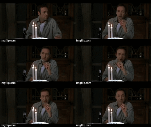
On the left is a shot from our thriller, this is when the father starts his rage. The other gif is a shot from American Beauty, also where the father starts his rage. We had a close up of a father to emphasis his facial emotion, much like in the other gif.

On the left is another gif from my thriller, this one is a close up/long shot of the father. My group and I wanted to give of the impression that he was completely zoned out. On the right is a gif from breaking bad, they were trying to do a similar thing. They used a tilt instead of a close up but I still see similarities.


Saturday, 14 February 2015

Getting An Idea Of Target Audience


To get an idea of what film genres people in my target audience are into I went out to Nyon ( a village in Switzerland) and asked people two super basic questions (not including asking for names and ages). Firstly we asked what is their favorite genre of film, secondly we asked if they liked thrillers. Even though most of them said they enjoyed thrillers none of them said it was their favorite genre, most said that their favorite genre is action or comedy.
After discussing with my group we agreed that 16-25 should be our secondary target audience as teenagers and young adults watch thrillers but it tends to not be their favorite genre. Our thriller is also based more on this struggle that the father is going through, this makes the film more relatable to fathers and mothers. This adds to the feeling of this film being for an older audience. We agreed that our primary target audience should be 25-40.
So I will be interviewing people in this age range, I expect this will be less of a hassle as English people tend to not mind being on camera as much. I was aiming to get at least 20 interviews on the day of my first interviews, but as I discovered on that afternoon people in Switzerland mostly really dislike being on camera. 

Account Of Editing Process


Today I finished editing my groups thriller, here is a screen shot of the final product on adobe premier. On the top left we have our folders with all of our footage and audio. In the bottom we have our timeline, this is where we can move the footage and audio around and edit them, in the top middle we have effects and some other tabs and in the top right the live preview.


Here is a title I was working on. My group and I later decided that having text during the sequence would take away from the fathers mood. We were planning on having the other titles fading in and out from both bottom corners on the table. This could give us some issues as this zone wasn't part of the title safe area. The title safe is a box that outlines where the text should be so that it is seen on all (or at least most) screens.


Below is a close up of our timeline, the light blue bars and everything above is footage and everything below the light blue bars is sound. The bottom two lines are sound effects and music we put in to add tension, this is for when the father is on his rage, At the very left we can see two pink bars, these are the titles that fade in and out before the footage and audio.

Tuesday, 10 February 2015

Account Of Shoot Day

In the morning of the shoot I was very confident, especially with all the preparation that our group had done. 
The only thing I wasn't sure about was the actors, I had never met Simon before and he played a major part in the production of our thriller as he was the father. I also hadn't seen Molly (acting as the daughter), Katie (acting as the girl guest) and Clare (acting as the mother) act before. I wasn't disappointed by any of the actors, they all did a great job in making the shoot look like a real life family with friends over and not simply actors saying lines. On the right there is a gif of a couple seconds I filmed when I wasn't on the camera. Phil did a particularly amazing job acting as the furious father. We were lucky with the weather, we didn't really need to have sun light even though the sequence is meant to be in the morning as it could just simply be a cloudy morning. I do find that the natural light looks great. Our actors also did a great job dressing as asked in the props list, all looking formal and like they are about to go to work or school.

On the day of the shoot we went to Adam's house and cleared his table and the widows to make everything seem very clean and perfect. I think that the table and dinning room really fit what we were looking for. Which was basically your stereotypical eight seat family table in a family dinning room. 

Here is a picture of the kids talking about the previous night before the father arrives.
We used a tripod for all of are shots, for most of the time the camera wasn't moving. For the shots where the father looses it and he goes crazy on the kinds I applied some follow type shots where I would try to keep up with were his face was and where he was facing. So if he turns to the left to start insulting one of the kids on the left I would radically move the camera that way so the audience can get a feel of this pressure being aimed right at the kid. I also applied some shake to the camera movement to make the moment feel unstable. 
Overall I was very content with the shoot, great actors and location and I think my group and I did a good job directing the actors.and working with the cinematography. 


Monday, 9 February 2015

Dexter

Dexter:

The opening sequence for Dexter is in many ways relate-able to our product idea. We would like our title sequence to give of the impression that everything the characters are doing is normal but that it doesn't feel normal. Such as when Dexter is shaving, obviously shaving is a normal thing to do, but with the use of super close up and sound it feels painful watching him shave.

Research: Credit Order

Se7en Opening Credits:
I find that the opening credits for Se7en are really well done, it doesn't contain anything particularly scary but comes across as freaky. A lot of it consists of shots of paper and books, many with black lines covering information. Of cours one of the first names that we are going to see come up is Brad Pitt, which is smart as by seeing this actor that most people recognize the viewer might be more intrigued towards seeing what Brad does in the film.


Sunday, 8 February 2015

Friday, 30 January 2015

Friday, 23 January 2015

Shot List

Shot  No
Action
Location
Shot Type
Shot Movement
Shot   Duration
1
Sitting around the table, family dinner
Dining Room
W
Establishing shot/pan
3-4 sec
2
Sitting around the table, family dinner
Dining Room
M
Over the father’s shoulder shot
2-3 sec
3
Father carving tomato
Dining Room
M/CU
Stable shot of the father
1-2 sec
4
Carving Tomato
Dining Room
CU
Close up of father cutting
3 sec
5
Father swallowing tomato
Dining Room
CU
Close up of father swallowing
2 sec
6
Reaction of the guests
Dining Room
M
Stable shot of the reaction of the guests
2 sec
7
Mother pouring the wine
Dining Room
M/CU
Stable shot of  mother pouring the wine
1-2 sec
8

(Slow motion) wine is poured in the glass
Dining Room
CU
Close up of wine pouring
3-4 sec
9
Mother takes the glass and starts to drink from it
Dining Room
MCU
stable shot, mother starts to drink
2 sec
10
Mother drinks the wine
Dining Room
CU
mother drinks, lips are shown
3 sec
11
Reaction of the children, while they are eating
Dining Room
MCU
reaction
4 sec
12
Mother realizing that the food is ready, going to get it
Dining Room
M
reaction
5 sec
13
Mother walks into the kitchen
Kitchen
M
shot is done from the kitchen,we can see children through the door
4 sec
14
Mother gets the meat
Kitchen
CU
Shot is done from the oven
4 sec
15
Drops one peace of food
Kitchen
M
Shot is done that we can see children through the door
5 sec
16
Meat is on the floor
Kitchen
CU
Close up of meat lying on the floor
2 sec
17
Mother picks up the meat
Kitchen
CU

2 sec
18
One of the child sees that mother has dropped the food
Dining room
M
The shot is done nearly over the childs shoulder
3 sec
19
One of the child sees that mother has dropped the food
Dining Room
M
The shot is now showing childs face and reaction
2 sec
20
Mother puts the meat on the plate
Kitchen
MCU
Mothers reaction shot, she doesn't care
3 sec
21
Mother takes the food and going to the dining hall
Kitchen
MCU
Smiling, reaction
3 sec
22
Mother entering the dining hall,smiling and saying «Here comes the food»
Dining Room
M
reaction
5 sec
23
Mother gives out the food
Dining Room
M
dialogue
4 sec
24
Mothers back, going back to the seat
Dining room
M
back
6 sec
25
Father reaches for the food
Dining Room
M
side shot
3 sec
26
Fathers sleeve with the blood on it
Dining Room
CU
side shot
2 sec
27
Child notices the stain on fathers sleeve
Dining room
CU
close up of the reaction
4 sec
28
Dad covers his sleeve
Dining Room
M
fathers reaction
3 sec
29
Guests eat
Dining Room
M
Guests reaction
6 sec
30
Mother saying «I know»
Dining room
CU
Mothers reaction
5 sec
31
Black screen
-
-
-
4 sec