Friday, 19 June 2015

Wix VS Word Press

In the past couple days I have tried to make websites for two artist, one for A$AP Rocky and one for Drake. For A$AP Rocky I tried using wix and for Drake I used word press, firstly I'll talk about my much easier experience with Wix.

Wix was incredibly easy to use and just straight forward in general, the interface allowed for me to edit the site as its previewed and same goes for adding images. Here are the main tools I used to design the home page and about page.
The bar on the left was on the left of the screen, this had most of the things one could think of adding to a website, from social links, song previews to uploading pictures or videos to place anywhere on the blog. The right bar has all the basic tools to alter text such as its size, placement, font and more. 


Now moving onto word press, I had a very different experience. With wordpress you can't edit with the preview of the website, also the layout isn't very easy to understand. The general impression that I got from it is that its badly built, especially for new users. 

Below is a preview of the website I made with Wix:


Here are the links to the websites:

Wix:
http://victortreptowuk.wix.com/asaprocky


Word Press:
https://drakesadstuff.wordpress.com/

Thursday, 18 June 2015

Richard Dyer - Star image

Richard Dyer is a professor in the department of film studies in King's College London, he is better known for being a theorist on musicians, film and tv actors. More specifically he explains his view on the connection that famous artists have with their audience, here is one of his most famous quotes:
"Stars are representations of people, they are an image, not a real person, constructed out of a range of materials (advertising, magazines, films). They are merely products created by institutions for financial gain, and target one specific audience."
In his view the stars (famous artists) are simply fictional people, as in they don't act like themselves but as who they are believed to be. He also mentions that they are constructed out of a range of materials, with this he is referring to how stars are constantly trying to gain popularity, such as with advertising, magazines and films. To them even the paparazzi publishing a story on them because they did something silly is good, as it reminds the public that they exist.


Tuesday, 16 June 2015

Synthetic and Organic Album Covers

In this post I'm going to be talking about the difference in a synthetic and organic covers.


My first example is from Logic's most recent album "Under Pressure". This album contains hip hop and rap, unlike most hip hop and rap albums Logic isn't trying to be something he is not (it appears), which is the case for most rappers. Most rappers  are known for their flashy lifestyles (apart from their music career), from the cars, houses to the private jets. In Logic's cover we see his original 'Set up' or 'studio' as he describes in many of his songs.  
Logic is an incredibly likable character, weather it is all an image so his fans feel more connected to him or if its simply how he is, either way it clearly works for him with his recent success globally.   
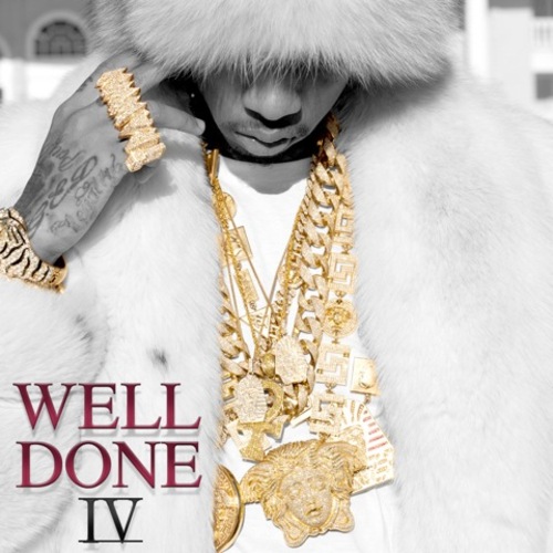
Here is an example of a synthetic mix tape cover (to the left). This is "Well Done IV" by Tyga, released in December 2013. Immediately by looking at this album we can see the impression that tyga is trying to give of with this, that he is rich and has "swagger". It isn't only his cover that seems to be super synthetic, so are his music videos, such as "Young Kobe", which consists of him rapping on a hill with his private helicopter and then flying out to his luxurious house. He's also wearing what seems to be a golden colored snapback following the color theme he set with the album cover.


Here is the music video for "Young Kobe", which is in Tyga's "Well Done IV" mixtape:

Analysing: Marlowe's Testcard and Roja Album Covers

In today's class we analyzed many of Marlowe's Album Covers, I found this task particularly difficult as I found it hard to make the connection with the type of music these album covers would best suit.

Here are the first three covers we looked at:


For the first cover of Marlowe's debut EP “its turning me on” we can see a woman or girl leaning over looking at a device. What is interesting from this album cover is that it has been faded in with red and some of it has been left with shades of black. This establishes Marlowe's color theme. The red gives of the impression that this album cover could be for genres like rock and alternative. The second album cover "darksparklecorner" really makes you wonder what inspired such a odd picture. The exposure has clearly been raised a lot, not sure what impression the artist or designer wanted to give with this. It makes me feel like the kid is even more surprised, this again gives the impression that the type of music that came with this album might surprise or excite you. This cover has also made me think if it was staged or not, maybe the picture was taken when actually surprising this kid to get a more honest reaction. The "a day in july" album gives of a very different vibe from the last two, unlike the others it has a lot of light and depth, this makes me think that the music will be more positive and happy in general. This also makes me think that this album will have more of a world music vibe.

Here are the other three album covers we looked at:
The “Deep Breathe Fake Air” album cover is one of the few that actually feel like they have a connection or that describe each other as we can see in it a person taking a breath. With this cover Marlowe is still using red as his main color, but this time has added in a lot of light blue. He also continues only using graphic covers, this must be a part of the image he is trying to build.

"Lines" is the penultimate album cover we looked at, as seen on the picture there really isn't much color, this cover consists of mostly white and black words and lines. The lines give of the impression that this album could have songs that are techno or just more house in general. There isn't much more I get from this picture. 

"Promises I should have kept" is the final album we looked at. Immediately from looking at this cover it gives of a vibe that the music in it will have a Latin feel, such as salsa, merengue or tango. In this album like most Marlowe put or choose there to be some red, even though the general theme of the cover is black and white. It does make sense that "ROJA" is written in red as it means red in Spanish.


Sunday, 14 June 2015

Music video analysis Madonna: Like a prayer

In 1989 Madonna released the music video "Like a prayer" which led to a lot of controversy, especially from different ethnic groups and Christians. There are many clear reasons for this, the video has several factors that come across to many (from the time) as wrong for many reasons.


The video shows us Madonna's visit to church and has flashbacks from her past. One of the first things she does is go up to what appears to be Jesus, in this video he is african american, this alone would have already brought up a lot of controversy at the time to many Caucasians, especially ones that were racist, which will have been many more people than today. It was later discovered that this man wasn't meant to represent Jesus but Madonna probably wasn't disappointing with this as it just led to more people talking about it and making her music and herself more relevant. Even though Madonna might have not intended to make this african american  man be represented as Jesus she certainly knew that there would be lots of talk about how the only holly figure she shows is african american.

Another major part of the video that caused so much controversy is a scene where she falls asleep and remembers her past. In this scene we see a squad of white males stabbing and harassing her, we then see that the african american man that was before seen as Jesus is running to help her as the white men ran away, he is then caught by the police and the police think he injured her. It is clear why this caused a lot of controversy. Firstly there will have been many Caucasian men that will have said that this is a bad way to display police officers as they aren't trying to be racist or stereotypical but happen to have only seen the african american man. This will also have made many african american's want to speak up and express their hate for segregation due to race, as they might have claimed that the police saw the gang of Caucasian males but decided to ignore it because they thought that the african man deserved it or was about to do the same.        


Below is the music video for "Like a Prayer" by Madonna